SLO Living
I've had the pleasure of working as an Advertising Designer at Mustang Media Group, a national-award winning college media publication entirely run by students like me. Throughout the past 2~ months, I've worked closely with a few other designers to create SLO Living, our annual publication targeted for students on campus specifically. With nearly 6,000copies being printed and put into circulation, and over $13,000 in advertising placements, this is my proudest and most notable work as a designer! Come check out my layout and design work for SLO Living!
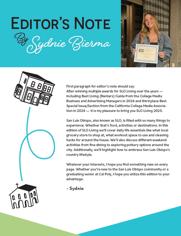
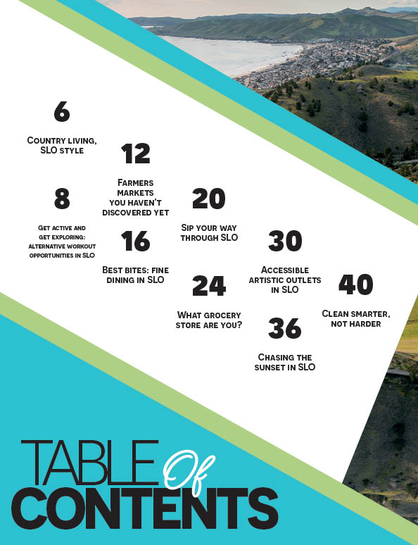
This is the content for the Editor's Note and Table of Contents section. I wanted a dynamic design using the colors set by my team in our design system. In previous editions, they were much less text heavy as the editorial team had more restrictions. I had to find a way to include all the articles in a succinct but also eye-catching fashion, and I think I did a great job.
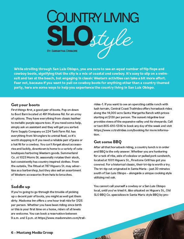
This article was intended more for students coming from more rural parts of California, which SLO has lots of. For kids like these, we are hopefully able to give them a good idea of what SLO really is like. Once again, super proud of this layout and especially the title.
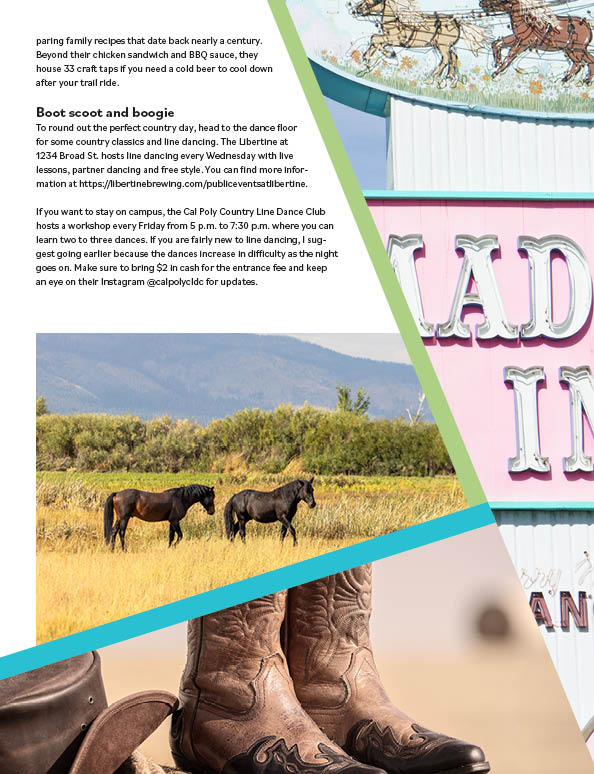
This double page spread was another great use of columns in my layout. After taking GRC 318, a typography class exclusively using InDesign, I've gotten pretty good at making dynamic layouts using more than just images and text. Initially, I struggled to find a way to use the landscape element, but adding it above and filling gaps in space with illustrations from the front cover really brought the design together.
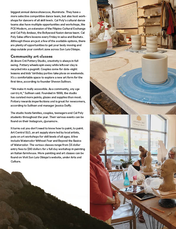
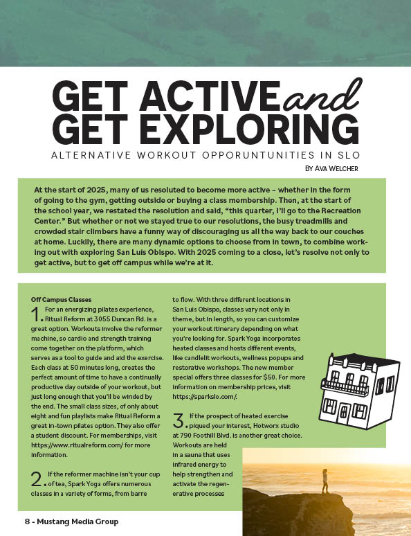
This was another example of a layout which I really struggled with at first. It lacked a lot of text and really just came down to my design. I leaned a lot on the few stock images MMG has available and was able to make a pretty satisfying and clean looking layout.
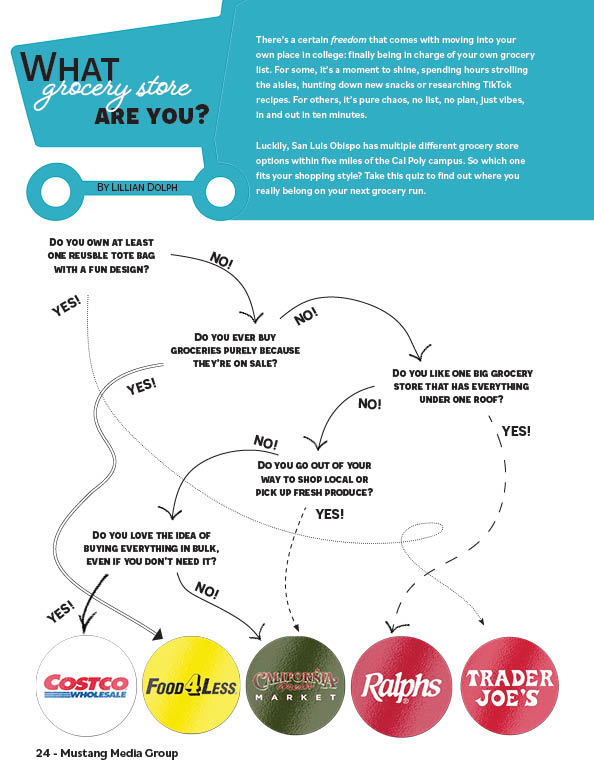
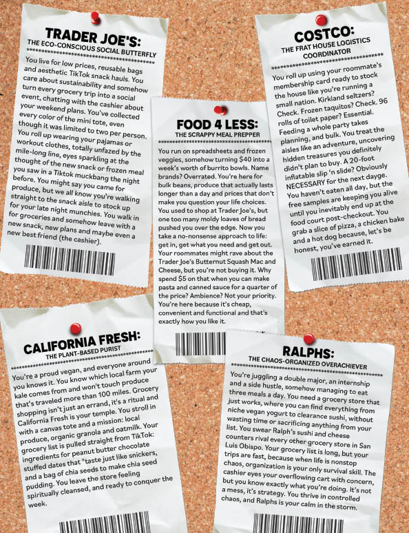
By far the proudest double page spread I have created. I recieved a lot of help from my peers for this design, especially the verso page (left side). I created the corkboard receipt page all by myself though and I'm quite proud of how it looks while also maintaining it's legibility.
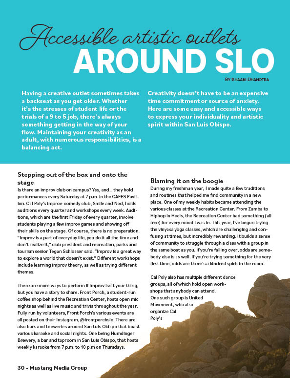
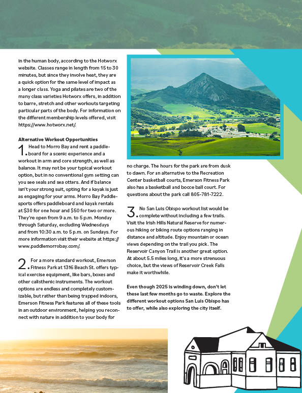
The final double page spread I am including is this simple layout here. I had the concept of using Bishop Peak, one of the three big mountains in SLO as a backdrop and text wrapping around it. The process of creating this was a lot simpler than expected, but it's effect is super nice and comes through really well on the actual paper!